
Last week I launched the NHS Board Radar: a free map of all forty-two English health systems, scored on the nine national priorities from their own board papers. This week, how it was built, and why that matters when you use it.
Most reads of NHS performance work like this. Someone shows a board a coloured heatmap. Every cell has a colour. None of the cells has a source. If a regulator asks the chair where the amber on workforce came from, there is no answer. It is a judgment with a colour on it.
The Radar was built the opposite way. One rule, set at the start: every score must be traceable to a paragraph in a public 2026 board pack. Not a paraphrase of the paragraph. The paragraph, with a page number.
That rule was harder to hold than it sounds.
The numbers behind the map: forty-two health systems, nine priorities each, two scores per priority (how important the board says it is, and how well they say they are delivering). Below the system level the map goes down into the individual trusts and integrated care boards. The full evidence base is 949 scored cells across 124 organisation records.
Of those 949, 940 carry a page reference to the exact board pack they were scored from. The other nine are flagged, in the open, as scored without one.
That is the whole discipline. If you disagree with a score, you can open the pack, turn to the page, and argue the point. Try it. Pick a system you know and check the evidence behind one of its scores. That test is exactly what the tool is for.
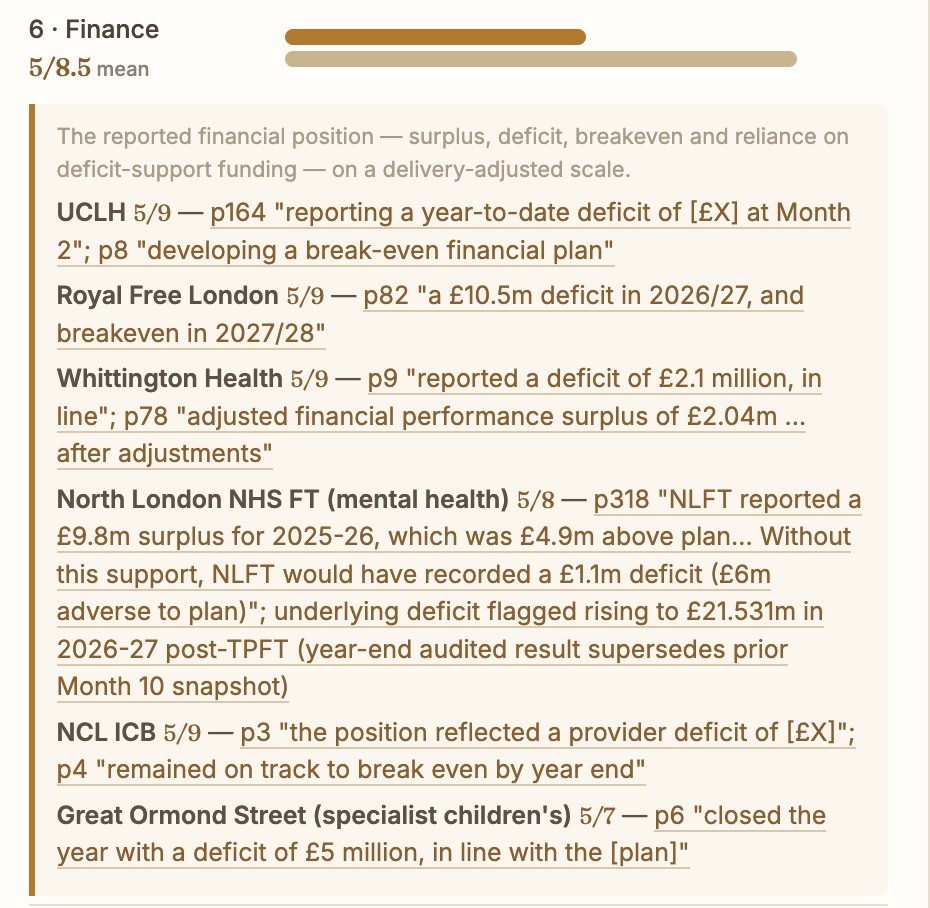
Two more things are stated openly in the map.
First, every one of the forty-two systems is in it, even the ones whose board papers are late or thin. Where systems have merged under this year’s reduction to thirty-six integrated care boards, the old footprint stays in the map with a note, so nothing is quietly dropped to make the averages look better.
Second, coverage is not complete everywhere, and the map says so. Not every trust in every system has published on every priority. The two priorities with the thinnest coverage are the single patient record, where only 41 percent of organisations have said anything on the record, and AI, at 63 percent. Those gaps are findings in themselves. They are also the first thing the October refresh will chase down.
A read that cannot be reconstructed is not a read. It is a vibe.
None of this makes the map correct. It makes it checkable. That is the difference between a read a board can act on and a read a board just files.
The Radar refreshes quarterly. Same systems every cycle, so when a score moves, something actually moved.
Here is how to use it.
If you sit on an NHS board, look up your own trust and read the evidence behind your scores. If a score feels wrong, the page reference tells you exactly what it was built on, and you can take that to your next meeting.
If you sell into the NHS, look up a prospect and read what their board actually said about the priority your product touches. Their own words are your opening line.
If you invest in health tech, test the map against what your portfolio companies are telling you about their NHS pipeline.
The map is at ortent.co/tools/nhs-board-radar. The full methodology is in the whitepaper alongside it. No form, no email. Open a system, click a score, read the evidence. That is the whole product.